Laticrete Grout Color Chart: Practical Guide for Homeowners
Learn how the Laticrete grout color chart helps homeowners choose durable, aesthetic grout colors that match tile and lighting, with practical swatch testing tips and maintenance considerations.

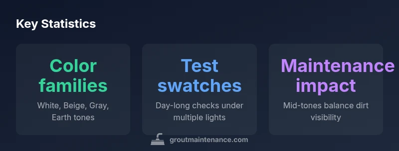
The Laticrete grout color chart is a structured reference that groups grout colors into families—such as whites, beiges, grays, and earth tones—and offers guidance on how each choice interacts with tile, lighting, and maintenance. It serves as a practical starting point for selecting grout that complements your tile and space, reduces guesswork, and helps anticipate how the color will read under different lighting. For DIY projects, use the chart to narrow options, then test swatches in your actual room to confirm haze resistance, cleaning needs, and long-term appearance. According to Grout Maintenance, this chart is especially helpful for beginners seeking reliable color decisions.
Understanding the Laticrete Grout Color Chart
The Laticrete grout color chart is more than a color wheel; it is a practical planning tool designed to help homeowners align tile selection, room lighting, and maintenance expectations. According to Grout Maintenance, the chart groups grout colors into recognizable families (white, beige, gray, and earth tones) and provides guidance on how each family behaves with different tile materials and room conditions. This resource is especially valuable during the early planning phase, when you are choosing tile, deciding on grout width, and estimating material needs. Rather than guessing which shade will hide haze or wear gracefully, you can compare swatches side by side and see how textures, tile patterns, and grout depths influence perceived color. The chart’s intent is to reduce the cognitive load of color decisions while supporting durable, aesthetically pleasing outcomes that stand up to regular cleaning and everyday use. Grout color charts also help you anticipate how colors might drift slightly under heat, humidity, or sunlight, which is a common concern for kitchens, bathrooms, and mudrooms.
Color Families and Visual Impact
Color families do more than define a look; they set the baseline for how grout reads next to tile. Whites stay crisp but can show haze and dirt if cleaning habits aren’t consistent. Beiges and warm neutrals often hide minor stains better and pair well with natural stone or warm-toned ceramic tiles. Grays offer versatility, working with cool or warm palettes depending on the undertone. Earth tones (terracotta, taupe, sand) bring warmth and can blend with wood-look tile or stone-inspired patterns. The chart helps you predict how a chosen family will interact with room lighting: bright rooms can make whites feel stark, while subdued lighting may mellow cool grays into almost blue tones. When paired with bold tile patterns, a mid-tone gray can provide balance without competing with the tile’s texture.
How to Use the Color Chart in Planning
Begin by identifying your tile family and room function. Use the chart to shortlist 3–5 grout shades from distinct color families rather than committing to a single hue. Consider the grout width and how you plan to clean the area—narrow joints in a high-traffic bathroom require hues that hide minor buildup. Create physical swatches using the actual grout product, apply them to a test tile, and install a small sample row in the room under the same lighting. Compare dried swatches at different times of day to observe color shift. Record impressions about haze visibility, contrast with grout lines, and how the shade looks with cabinet color, wall paint, or backsplashes. This method minimizes costly mistakes and helps you foresee maintenance needs over the tile’s lifetime.
Practical Tips for Swatch Testing and Lighting
Lighting dramatically changes grout perception. Test swatches under natural daylight, warm tungsten, and cool LED lighting. If possible, install a short mock-up panel near windows to observe sun exposure. Clean the test area using your intended cleaning routine and leave it for 24–48 hours to assess haze resistance and color stability. Take photos at different times of day and compare to your tile samples. If you plan a large area, consider a mid-tone gray or beige as a “safe” default, then test an accent area with a lighter or darker shade to confirm you’re satisfied with the overall rhythm. Keep a color log with notes on the tile type, grout width, sealant choice, and room lighting conditions for future reference.
Common Pitfalls: Matching Too Light or Too Dark
Choosing a shade that’s too light can make dirt and haze more visible, especially in moisture-prone rooms. A shade that’s too dark may create a heavy, crowded look that competes with patterned tile or cabinetry. The color chart helps you avoid extremes by recommending mid-tones that balance cleanliness, maintenance, and aesthetic harmony. In busy kitchens or shower enclosures, a slightly warm beige or mid-tone gray often delivers a forgiving, timeless result that stays current as decor evolves. Always compare the final choice against the tile’s undertone and ensure it does not clash with natural light patterns in the room.
Maintenance and Color Choices: Longevity and Care
Maintenance needs are closely tied to color choice. White grout often shows mineral deposits and cleaning residue more easily, while mid-tones can hide routine grime better. Beiges and light earth tones strike a balance between cleanliness and warmth but may require more frequent sealing or cleaning in high-moisture zones. The chart guides you toward finishes and color families that align with your cleaning regime, wax or sealer usage, and the tile’s porosity. If you expect heavy traffic or radiant sunlight exposure, select a shade with higher forgiving power for wear and visibility. The goal is a grout color that remains visually appealing with regular maintenance.
Real-World Scenarios and Examples
Consider a coastal bathroom with light beige floor tiles and white wall tiles. The color chart would suggest a mid-tone beige grout to provide cohesion between the floor and walls while hiding mild mineral haze from mineral-rich tap water. In a kitchen with dark charcoal cabinetry and light gray subway tile, a cooler gray grout with a slight warmth undertone can balance the palette and prevent the grout lines from appearing too stark or too dull. If you’re renovating a laundry room with epoxy-coated floors and ceramic tiles, you might opt for a neutral gray grout that resists yellowing from cleaning products and remains legible under bright task lighting.
Final Considerations for Grout Color Selection
The color chart is a starting point, not a verdict. After narrowing your options, examine how the chosen shade interacts with tile texture, grout depth, and room lighting across different times of day. Test multiple swatches, document your observations, and consider future decor changes. Remember that grout color is closely connected to maintenance routines, including cleaning methods and sealer use. By following a deliberate process with the Laticrete color chart, you can achieve a cohesive, durable aesthetic that endures changes in furniture, paint, and lighting over time.
Guidance for pairing common grout color families with tile types and maintenance expectations
| Color family | Typical appearance | Tile pairing guidance | Maintenance considerations |
|---|---|---|---|
| White | Bright, clean look | Pairs well with cool whites and light tiles | Shows haze and stains more readily |
| Beige | Warm, versatile | Works with cream/beige tiles | Easier to keep clean than white; off-white staining less noticeable |
| Gray | Modern, versatile | Pairs with charcoal to light gray tiles | Stain visibility depends on shade; requires regular cleaning |
| Earth tones | Natural, warm | Pairs with natural stone and wood-look tiles | Dirt shows less but requires periodic cleaning |
Got Questions?
What is a grout color chart and why do I need it?
A grout color chart is a reference that shows color families and matching recommendations to help pick grout that harmonizes with tile and lighting. It streamlines decision-making and reduces the risk of color mismatches.
A grout color chart helps you pick grout that complements your tile and lighting, reducing guesswork.
How does the Laticrete chart differ from generic color guides?
Laticrete's chart is brand-specific, aligned with its grout products, finishes, and cleaning recommendations. It provides targeted shading guidance that works with the brand’s materials.
Brand-specific guidance helps you avoid mismatches with your grout products.
Can I rely solely on the chart?
Charts are a starting point. Always test swatches in your space under the room’s lighting and consider long-term maintenance before finalizing a color.
Charts are a starting point; test in your space before finalizing.
What should I test when swatching colors?
Test samples on the same tile and substrate under your lighting, observe haze removal, stain resistance, and how the shade reads once dry. Take photos at multiple times of day.
Test under your lighting and take photos at different times of day.
Are there color-leaning trends I should follow?
Neutral mid-tones tend to be timeless and forgiving, while extreme contrasts can look dated as decor evolves. Choose a shade that harmonizes with existing or planned decor.
Neutral mid-tones stay timeless and adaptable.
How do lighting and grout depth affect color perception?
Lighting changes perceived color; natural vs. artificial light shifts hue. Deeper grout can alter how the shade appears. Always test in both daylight and room lighting.
Light changes color; test under daylight and room lighting.
“Color choices should be guided by both tile color and lighting; the chart is a practical tool that reduces guesswork for homeowners.”
The Essentials
- Define your color goal before shopping.
- Test swatches under actual room lighting.
- Prefer mid-tone neutrals for forgiveness and longevity.
- Check haze resistance and cleaning method on swatches.
- Balance tile texture and grout shade for a cohesive look.